

Understanding lean visual management tools
THE NAKED GEMBA – This useful article helps us to understand the different type of visual controls we can put in place, how they work and which ones to use to best convey our message.
Words: Severino Abad, Lean Coach, Instituto Lean Management – Barcelona
The Japanese term Mieruka (“visual control”) represents one of the most powerful lean tools available to us practitioners. It allows us to synthesize and visualize the information on the performance of a process to make it easier to understand; at the same time the information needs to be complete enough to enable us, with just one glance, to make the right decision on how to proceed. A breeze, right?
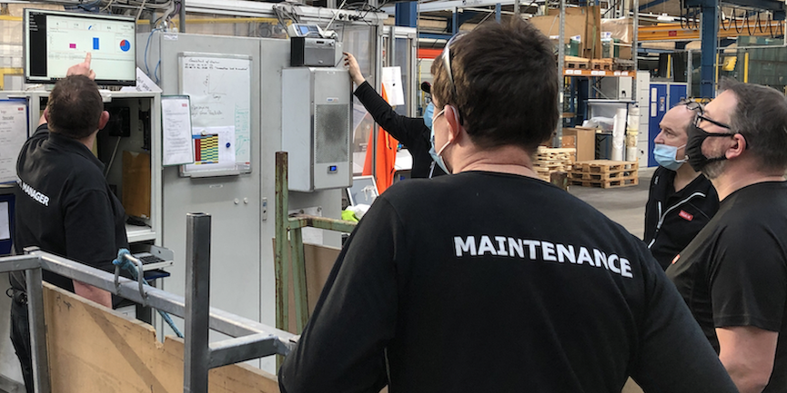
On the gemba, the presence of visual controls typically translates into certain elements that unequivocally indicate we are standing in a lean plant. Based on the information they provide to us, these visual elements can be classified in different groups:
- Visual signals, which aim to explain to us what we are looking at. For example, they can indicate the production area, the process, or machinery. Common visual signals include: marks on the floor used to define certain spaces – like resources, walkways, material intake, tooling area, etc; panels carrying tools and/or consumables (like nuts and bolts); safety-related signs (emergency exit, fire extinguishers, etc); the andon light of a machine or a process showing the current state; or even the documentation related to standardized work.
- Visual instructions, which aim to easily show us how to behave in a certain area. These range from Job Instructions to traffic light systems (green-yellow-red) telling us what to do based on the color, from color-coded lines on the floor helping us to identify different areas of a site to signs telling us where materials are moved.
- Visual measurements, like panels displaying the current performance of a process against the expected performance (by means of a simple meter). These can also include a multi-skills matrix (like a ILUO graphic) – telling us not only what skills a person in a workstation has but also what skills that person should develop over time – or a project management board.
- Visual representations of processes or concrete activities, including value stream maps, A3s, preventive maintenance boards for a cell, Gantt diagrams of a Project, or even Obeya rooms.
This is what we typically think about when we hear someone talk about visual management or visual boards. These tools shouldn’t be just a repositories of graphics and data; they need to actually make it easier to identify anomalies during the execution of a process, initiating problem solving and encouraging discussions that lead to the development of the people involved in the process.
For this to happen, the visual systems we put in place need to have certain characteristics:
- They have to be a clear and easy-to-understand reflection of how the process is behaving. In fact, many companies use the so-called “10-feet model” to gauge the effectiveness of their visuals: people will need to be able to read and interpret the information on the visuals from 10 feet away. While seemingly arbitrary, this approach actually contributes to our lean practices – for instance, ensuring quick and easy access to information for managers on a gemba walk. Of course, the visual has to clearly display any kind of deviation.
- They have to be owned by the team in charge of the process, not their manager. This is essential to reap all the benefits of a visual system and to guarantee its sustainability. Visual boards have to give the team the information they need to complete their work as expected. With this in mind, it’s important they carry those indicators the team has agreed on as objective measures of their performance. It is critical that the boards on the gemba speak the same language as the front-line operators: rather than complex measures with which middle or top managers are normally familiar with (like service rates or OEE for the former, and profits and losses for the latter), they should use simple indicators people understand – like the number of parts produced or orders processed. Don’t force the teams to standardize their visual boards; instead, let them own them and make them work for them. This is particularly important at the beginning, when people are still learning how to work with visuals. (When the teams are mature enough in their use of visual management, by all means do focus on looking for your “corporate style” and on standardizing it across the organization.)
- Like other lean tools, they should be created by hand and installed by the operators themselves, at the gemba. This way, we involve people and make them responsible for keeping the boards updated. This doesn’t mean that you shouldn’t use digital tools (like ExCel); just make sure it is still the operators doing it, instead of someone in Administration. Having the operator create and update the graphics with a simple marker makes them much more aware of the meaning of the results they are achieving. It also gives people the opportunity to confirm the accuracy of the data they gather by looking at the situation first hand: for example, if an operator writes down a very low level of scrap for a day of work but the red bin is full of faulty parts, he will be able to immediately question the information he has put on the graphic.
- They have to be located close to the process, in a safe place. It’s very common to find them hanging to walls located far away from the process or in the middle of a walkway: in the first instance, it’s impractical to have discussions about the process day after day in a place that is far from it; in the second instance, people typically just stop using the boards. Another common mistake is locating the boards in “uncomfortable” places like next to a compression machine or a piece of equipment emanating heat.
- They have to be used as the tools they are, not as wallpaper to make the production are look nicer or more sophisticated. The boards are supposed to encourage conversations at all levels, starting with those within the team to truly evaluate the performance of the process they are running and compare it with their expectations. For this reason, ensure the boards don’t carry an endless number of KPIs, but only those that give us the information we need. Five or six KPIs are ideal. I once read the following explanation, which I find to be really good: the boards have to “translate data into information, information into meaning, and meaning into behavior”. That’s how they tell us what we need to do at any given moment.
In Storytelling with data, Cole Nussbaumer offers six key tips to draw a good visual board. Of those, I think three are particularly important:
- Understand the concept. Before designing your visual system and starting to visualize information, we have to be clear on the context in which that need to communicate exists. We have to clearly define the What (what do we want to communicate o want people to know?); the Who (who is this information for? Just for the team? For the manager? For the whole organization?) and the How (through visual boards, regular reports, daily meetings or presentations). This is how we can engage everyone in the use of visual controls.
- Choose the right visual tool. Depending on the information we want to share, the visual tool we use will change. There are several ways to share information visually (Visual Thinking is the focus of an ever-growing number of studies and experiments), from just a few letters and numbers to list the prices of fuel at a gas station to the traditional sign showing the number of days that have gone by without a safety accident in a factory. When it comes to dispaying a large amount of data, tables and graphics are the best tools: tables are great for ordering and extracting data, whereas graphics represent a faster way to share a piece of information.
- Eliminate confusion and focus your attention on what matters. In itself, the use of visual elements to transfer information doesn’t guarantee you will obtain all the benefits of visual communication. For that to happen, your visual controls need to be clear, straight to the point and focus on the information you need.
Let’s look at a few practical examples now.
First, one in which the selection of the type of graphic is not ideal to share a certain type of information:

The four graphics carry the same data, but which one is best suited to sharing this particular type of information?
Of the following examples, which gives us the clearest overview of the current state?

The 3D graphic is the first one we can rule out, because it is not a format that everyone is able to read correctly. The flat cake graphics are much better, but are they the best way of visualizing the information? No. The best one is the bar chart, because it makes the relevant information stand out the most – making it harder for us to oversee it.
Let’s look at this one now:

Which ones of the three graphs showcases the information we are studying (the B) most clearly? In the second one, the blue bar stands out more than in the first one – making it much easier to understand what we want to communicate. However, the interpretation of the graphic is still complex. If we turn the bar chart into a line diagram (the third graph), the information improves markedly.
Here’s another example. Of the following graphs, which one offers information in the most intuitive way?

The graph in the top left is very “heavy” and full of superfluous elements, but as we move to the other graphs the situation improves and the information becomes much more discernible.
One last example, which shows how powerful simplification is:

Having a system that brings to one place all the essential information on the performance of a process will allow us to detect anomalies right away and will naturally kick-start the problem-solving process with the aim to delight the customer – which is the ultimate goal of lean thinking.
Severino's other articles from this series - The Naked Gemba - focused on supermarkets and value stream mapping. Stay tuned for more.
THE AUTHOR

Read more


INTERVIEW - In this video interview, René Aernoudts, Michael Ballé and Dan Jones answer a few key questions on what's next for the lean movement.

FEATURE – Thanks to Lean, EHA Clinics improved safety, efficiency, and patient experience. Now they’re hoping their results will inspire a growing movement to transform healthcare across Nigeria.
CASE STUDY – The authors discuss how rooftop window producer VELUX harnessed Lean Thinking and Industry 4.0 to empower shop floor workers, after rediscovering the kaizen spirit following a digitalization initiative that didn’t work out.

INTERVIEW – Dan Jones will be a keynote speaker at this year’s Lean IT Summit in Paris. In this interview, he gives us a sneak peek of what he is going to talk about.